
OtherEN
Intro to Git — Snapshots, Branches & Sharing
 WorkshopyOfficial
10 stepsQuiz9 interactiveDiagram
gitversion controlbeginners
Used by 1 teacherBeginner
CSS flexbox exercises on real page parts: write CSS in the lesson, match a target nav bar, card row and page, with checks as you go.
WorkshopyOfficial
78 lessons · used by 2 teachers
Sign in to copy it to your workspace. It’s free.
10 steps · 2 quizzes · open any step, or read it here
These CSS flexbox exercises start with a problem everyone who builds pages meets: you put a logo, three links and a button in a nav bar, and they stack one under another instead of sitting in a row. Flexbox is the part of CSS that lines boxes up, shares out the space between them and lets them wrap, and you'll practise it here on real page parts.
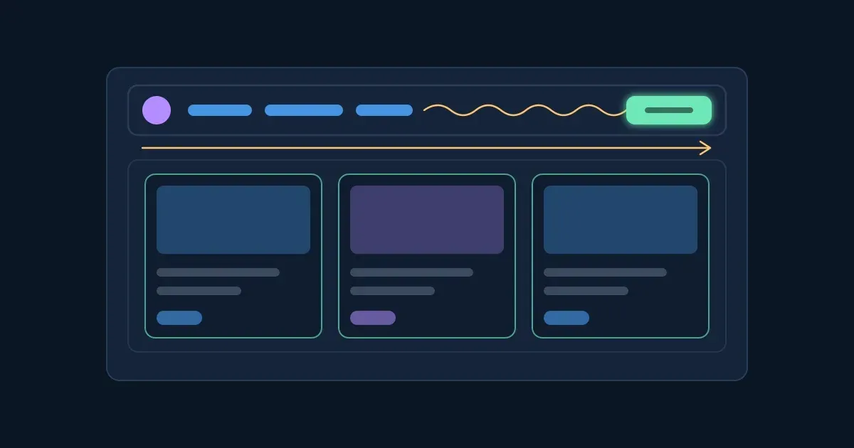
Interactive · From a stack of parts to a laid-out page — try it in the lesson
You just watched five parts of a nav bar flow onto one line, cards grow to share a row and a button get pushed to the far end. Each of those moves is one or two lines of CSS, and by the end you'll write all of them yourself.
flex-grow, flex-shrink and flex-basis, and work out the widths by hand.You need a browser and a little CSS: a selector, a property and a value.
Flexbox starts with one line of CSS on a parent element:
.nav {
  display: flex;
}
That makes .nav a flex container, and its direct children become flex items. Only the children: a link inside a list inside the nav is not an item of the nav.
What changes the moment you turn it on:
Every flexbox property belongs to one side. display, flex-direction, justify-content, align-items, flex-wrap and gap go on the container. flex-grow, flex-shrink, flex-basis, order and align-self go on an item.
Try it: switch on display: flex on the nav, then flex: 1 on the cards and margin-left: auto on the button. Then turn them off one at a time and watch which part moves back.
Interactive · Turn on flexbox and watch the page lay itself out — try it in the lesson
The cards row in the picture is a second flex container: a page is usually many small flex containers, one inside another.
Takeaway: display: flex goes on the parent; its direct children are the items you then arrange.
A flex container lays its items along a line called the main axis. The line across it is the cross axis. Every other flexbox property is defined by these two axes, so it pays to know where they point.
flex-direction sets the main axis:
| Value | Main axis runs | Cross axis runs |
|---|---|---|
row (the default) |
left to right | top to bottom |
row-reverse |
right to left | top to bottom |
column |
top to bottom | left to right |
column-reverse |
bottom to top | left to right |
In a right-to-left page row runs right to left: the main axis follows the writing direction.
When you switch to column, the axes swap. The properties don't: justify-content still works along the main axis (now vertical) and align-items across it (now horizontal). That swap is the most common surprise in flexbox.
The -reverse values change only where the items are drawn. The HTML order stays the same, so screen readers and the Tab key still follow the HTML.
Try it: do the three tasks. The dashed outlines show where each part should land; your boxes move as you type.
Interactive · Practice: flex-direction on a toolbar, a menu and a chat — try it in the lesson
Takeaway: flex-direction picks the main axis; row is the default, column stacks, and the -reverse values flip the drawing order only.
When the items don't fill the main axis, there is free space left over. justify-content, on the container, decides where that space goes:
| Value | What happens |
|---|---|
flex-start (the default behaviour) |
Items packed at the start, the free space at the end. |
flex-end |
Items packed at the end. |
center |
Items in the middle, equal free space on both sides. |
space-between |
First item at the start, last at the end, the rest of the space shared equally between items. |
space-around |
Each item gets equal space on both sides, so the ends get half a share. |
space-evenly |
Equal space between items and at both ends. |
justify-content only moves space that exists. If the items already fill the row (or overflow it), it has nothing to share and changes nothing you can see.
In the nav bar below, the links are wrapped in one div, so the nav has three items: the logo, the group of links and the button. That's why space-between puts the links in the middle.
Try it: three components, three values.
Interactive · Practice: justify-content on a nav bar, a pager and a dialog — try it in the lesson
Takeaway: justify-content moves the free space along the main axis; it does nothing when there is no free space.
align-items, also on the container, places the items on the cross axis: in a row, that's up and down.
| Value | What happens in a row |
|---|---|
stretch (the default behaviour) |
Each item without a fixed height is stretched to the height of the row. |
flex-start |
Items at the top, each at its own height. |
flex-end |
Items at the bottom. |
center |
Items centred vertically. |
baseline |
Items moved so the first line of text in each sits on one line. |
stretch being the default explains two things you'll meet often: a small badge that turns into a tall pill next to a big title, and an avatar that runs down the whole side of a long message. An item with a fixed height is not stretched.
Centring something vertically, the old CSS headache, is two lines on the parent: display: flex; align-items: center; (add justify-content: center; to centre it the other way too).
Try it: a dashboard header, a message in an inbox and a price tag.
Interactive · Practice: align-items on a dashboard header, a message and a price — try it in the lesson
Takeaway: align-items places items across the main axis; its default is stretch.
Four questions on what you've used so far.
Question 1. A nav bar's HTML is `<nav class="nav">` with a logo, three links and a button inside it. Where does `display: flex` go to put them in a row?
Question 2. A container has `flex-direction: column`. Which way does `justify-content: center` move its items?
Question 3. A flex container has no `align-items` set. What do its items do on the cross axis?
Question 4. Three items in a row with `justify-content: space-between`. Where are they?
Two container properties handle space between items and what happens when they don't fit.
gap puts space between items, never before the first or after the last:
.plans {
  display: flex;
  gap: 16px;          /* rows and columns */
  /* gap: 24px 16px;     row gap, then column gap */
}
Before gap worked in flexbox, people put margins on items and then removed the margin from the last one. gap does it in one line.
flex-wrap decides what happens when the items are wider than the container. The default is nowrap: all items stay on one line, and because flex-shrink is 1 by default, they shrink to fit, even below the width you gave them, until they reach their content's minimum width. After that they overflow the container. With flex-wrap: wrap, items that don't fit move to a new line instead, and each line is laid out on its own.
This is the usual cause of "my 220 px cards are only 180 px wide": the row is nowrap and the cards were shrunk.
Try it: avatars, pricing plans and skill tags.
Interactive · Practice: gap and flex-wrap on avatars, pricing plans and tags — try it in the lesson
Takeaway: gap spaces items without extra margins; flex-wrap: wrap lets items move to a new line instead of shrinking or overflowing.
Three item properties decide how wide each item ends up along the main axis:
auto means "use the item's width, or its content's size if it has none".0: items don't grow. Two items with flex-grow: 1 and flex-grow: 2 split the free space 1 : 2.1: every item may shrink. Shrinking is weighted by the basis, so a bigger item gives up more pixels. 0 means it never shrinks.The flex shorthand sets all three, in the order grow, shrink, basis:
| You write | It means |
|---|---|
flex: 1 |
flex: 1 1 0%: grow and shrink, start from 0, so the items share all the space by their grow values |
flex: auto |
flex: 1 1 auto: grow and shrink, starting from the item's own width |
flex: none |
flex: 0 0 auto: keep the item's own width, never grow or shrink |
flex: 0 0 160px |
exactly 160 px, never more, never less |
| (nothing set) | flex: 0 1 auto: don't grow, may shrink |
The difference between flex: 1 and flex: auto is the basis: with 0% the whole row is free space, so equal grow values give equal widths whatever the content; with auto each item starts from its content and only the leftovers are shared.
One more rule: a flex item won't shrink below its content's minimum width (min-width: auto). A long unbroken word or URL can keep it from shrinking; min-width: 0 on the item lets it.
Try it: a search bar, an app layout with a sidebar, and dashboard tiles.
Interactive · Practice: flex-grow, flex-basis and the flex shorthand — try it in the lesson
Takeaway: flex: 1 shares the space equally, flex: 0 0 <size> fixes an item's size, and grow values set the shares of the free space.
Work out each width by hand, then check. In every exercise the items have no padding, no border and no margin, and hold only a short word, so nothing stops them shrinking. A hint costs nothing.
flex-basis: 100px and flex-grow: 1, and no gap. How wide is each item, in px?flex-basis: 100px, but flex-grow of 1, 1 and 2. How wide is the third item, in px?gap: 20px and three cards with flex: 1. How wide is each card, in px?gap: 24px. The sidebar has flex: 0 0 240px and the main area flex: 1. How wide is the main area, in px?flex-basis: 400px and the default flex-shrink: 1, no wrap. How wide is each item, in px?flex-basis: 400px, item B has flex-basis: 200px, both with flex-shrink: 1. How wide is item A, in px (to two decimals)?flex: 1 mean in full?flex: 1 1 0%flex: 1 0 autoflex: 1 1 autoflex: 0 1 autoThree tools for when one item needs to break the pattern.
An automatic margin takes all the free space on its side. margin-left: auto on the last item of a row pushes it to the far end: the classic "logo and links on the left, account menu on the right". It works on the main axis whatever justify-content says, and margin: auto on a lone item centres it both ways. In a right-to-left page, write margin-inline-start: auto so the push follows the writing direction.
order changes where an item is drawn. Every item starts at order: 0; items are drawn from the lowest value to the highest, and equal values keep their HTML order. So order: -1 moves an item before all the others, order: 1 after them. It changes only the picture: screen readers and the Tab key still follow the HTML, so use it for small visual changes and change the HTML when the reading order should change too.
align-self is align-items for one item. It overrides the container's value for that item only: align-self: flex-end drops one item to the bottom of a row whose items sit at the top.
Try it: an admin header, a plans row and a code-review comment.
Interactive · Practice: margin-left: auto, order and align-self — try it in the lesson
Takeaway: margin-left: auto pushes, order reorders the picture (not the reading order), align-self aligns one item.
Time to put it together, the way pages are really built: several small flex containers, each doing one job. The HTML is the start of a product's landing page, with no layout yet. Write all the CSS for it.
What to use where:
flex value that starts each card at 200 px and lets it grow (the grow-and-shrink step).Try it: the comments in the editor repeat the targets. If you get stuck, each task has a hint.
Interactive · Build it: a landing page laid out with flexbox — try it in the lesson
Look at what the card row does: two cards fit on the first line, and the third, alone on the second line, grows to the full width. On a wider page all three share one line; on a phone each takes a line of its own. That is a responsive card grid without a single media query.
Takeaway: a page is a set of small flex containers; one or two properties each give you a nav bar, a card grid and a footer.
Six questions across the whole lesson.
Question 1. What is `flex: 1` short for?
Question 2. A nav bar is a flex row: logo, links, then a Sign up button. What pushes the button to the far end while the rest stays at the start?
Question 3. Three cards with `width: 220px` sit in a flex row 560 px wide and come out about 187 px each. Why?
Question 4. Which of these properties go on the flex container? (pick all that apply)
Question 5. A row has `align-items: flex-start`. One item has `align-self: center`. Where does that item sit?
Question 6. An item has `order: -1`. What changes?
Workshopy shares this lesson under CC BY 4.0. Anyone may use and change it, with credit to you. Anyone can learn it here, free. A copy in your workspace is yours to change and run live; your students never need an account.
Version 1Current
· First published
Copies are made from the current version. A copy you already have doesn’t change.
WorkshopyOfficial10 stepsQuiz9 interactiveDiagram
gitversion controlbeginners
WorkshopyOfficial16 steps2 quizzes15 interactiveDiagram
workshopyproduct touronboarding
WorkshopyOfficial10 steps2 quizzes10 interactive
data-literacystatisticsmean and median
WorkshopyOfficial11 steps2 quizzes10 interactive
webapisjson
WorkshopyOfficial9 steps2 quizzes8 interactive
webjavascriptfunctions


Comments
No comments yet. Be the first to say how it went.